BTL-195 Typeface
Typography Design
Self-initiated
Objective
A passion project that started while I was still in school: to design and produce a typeface of my own.
Approach
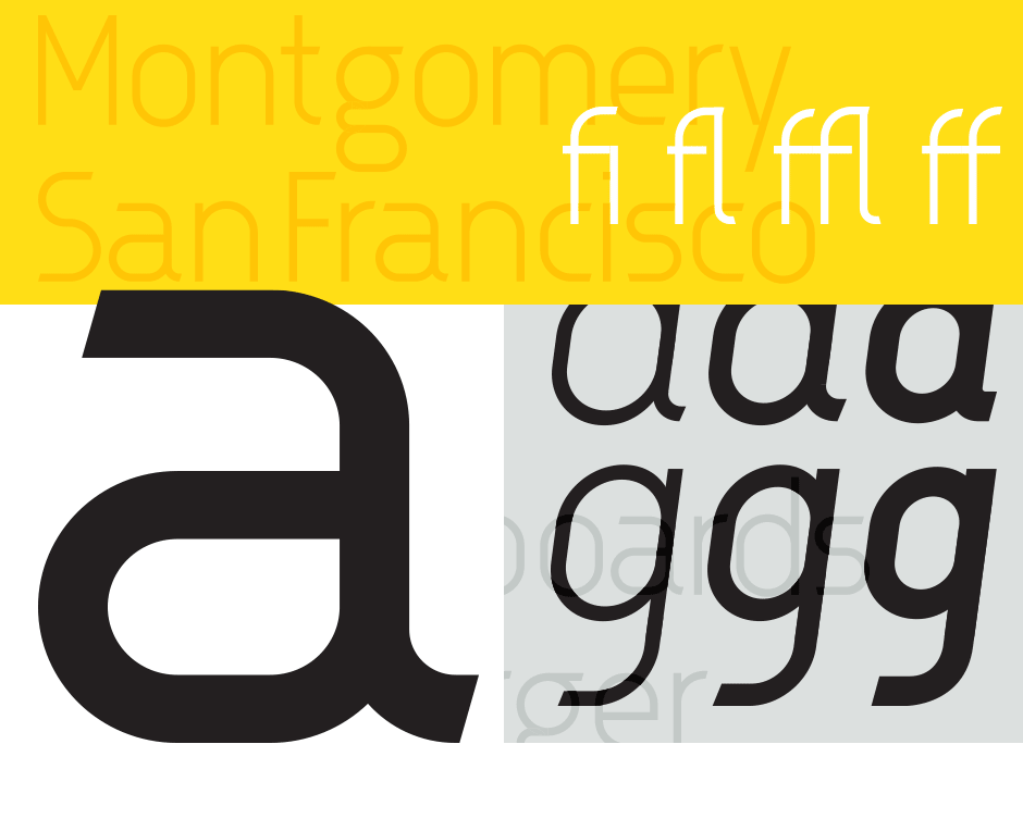
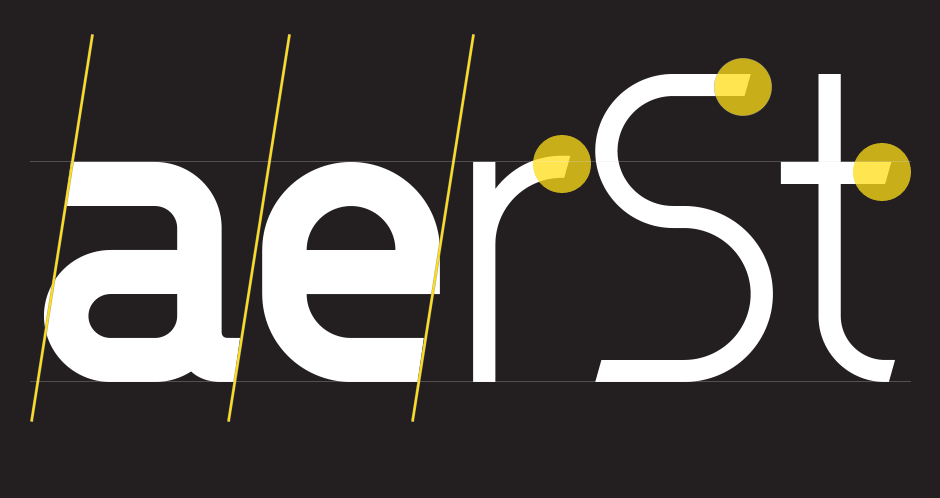
DIN and Bauhaus are two of the most well known typefaces for designers. DIN's clean geometric stems combined with Bauhaus' quirky bowls and finials makes the perfect inspiration of making a new geometric sans serif typeface. The name was derived from the abbreviation of the building's name and the computer number where most of the development of this typeface was spent.
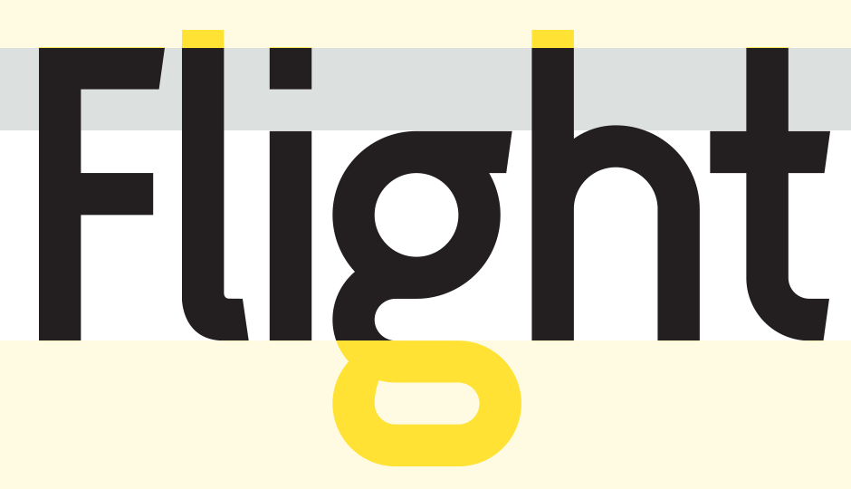
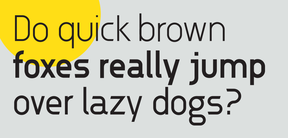
BTL-195 features three weights: light, regular, and bold. Although designed to be utilized as display text, the font also offers OpenType features such as ligatures and old style figures.